

Danville Flower Company
-
A local identity for a family owned florist and gift shop.
-
Create a brand that reflects the product and appeals to the target market to entice consumers to shop and increase sales. To build a more powerful social media presence in our local market.
-
I was given two weeks and was responsible for creating the design of the logo along with ideas for social media marketing and direction for photographic use.
-
Desktop research to determine local competition and target audience. Found that the majority of consumers are women, but that the men that do use the business tend to spend more, especially for special occasions.
-
Understand the brand
Understand the audience/market
Develop something flexible and easy to use
Create ideas for Socil Media Marketing -
Adobe Illustrator
Adobe Photoshop
Design Process
My first step was to understand and define the brand and it’s users. From there I ideated solutions developed those solutions into workable logos. The client had the final say in design, and chose their favorite, the one they thought best represented their brand. Finally, I developed a system of graphics that could be used for signage, bags, tags, gift cards, social media marketing, and more.

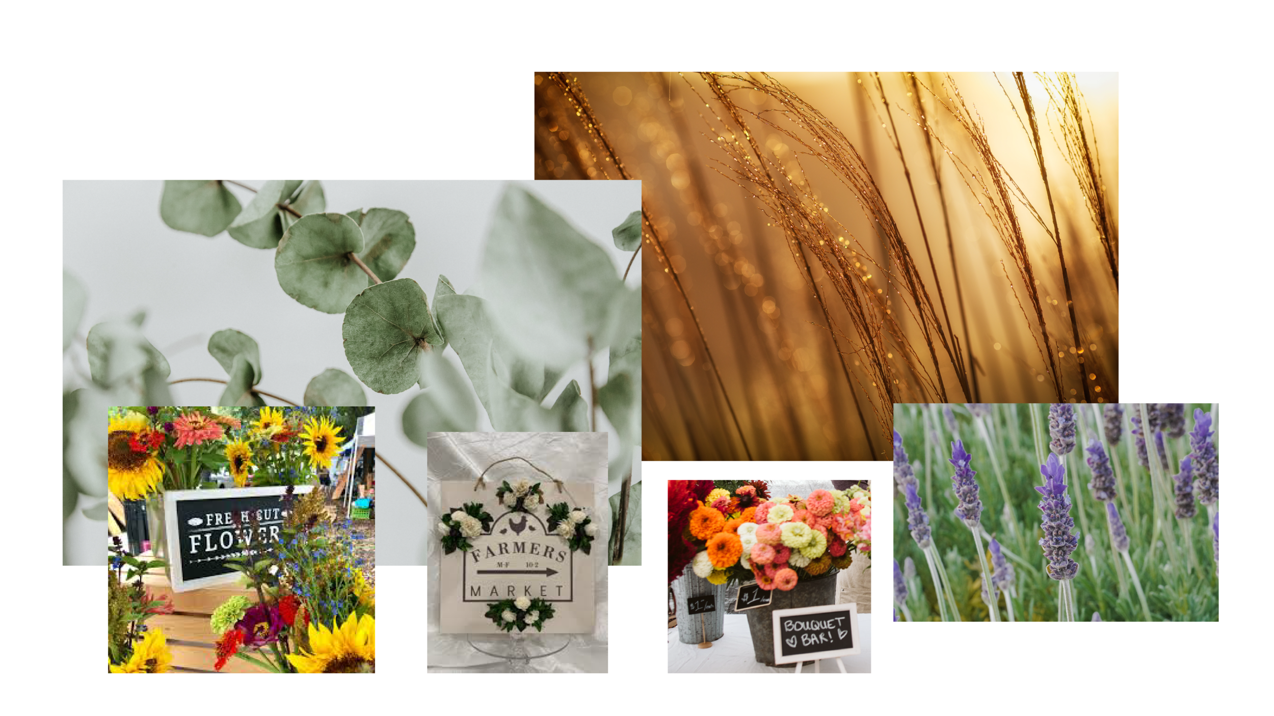
Inspiration

Define
To develop a brand for this floral and gift shop, I needed to understand the brand and it’s users. By conducting quick desk research of competitive brands in the local and online florist market, and the user/client base, I was able to determine some needs of the identity and who it should appeal to.
Who?
Women are the largest consumers of flowers, with almost 80% percent of flower sales being attributed to female customers. Also, it’s interesting to note that over 60% of flower sales are bought for the person who is actually buying them. Consumers consist of Home Flower Buyers, Gift Givers, Corporate Buyers, Event Buyers (weddings etc) and Funeral Home Flowers.
Male Gift Giver
Male 25 – 60 plus, Generally Tertiary Educated, Married or long term partner
Will buy flowers primarily for their partner
They are occasion and event driven IE Birthday or Anniversary or Valentine’s Day
They will spend more money
They will buy larger arrangement equating size with value and emotional outcome
More likely to buy roses and use a florist choice or pre-designed option
Female Gift Giver
Female 25 – 60, Working
Generally buys flowers for co-workers & Friends & Family
Is more likely to be looking for a product that evokes an emotional response in them
Likely to be more cost sensitive
More likely to request a specific combination of flowers for an order, or a change to an order
Corporate Buyer
Female 25, Working in an office environment
Buying on behalf of a business and more likely to have a regular floral order for an office
Ordering Flowers on behalf of someone as either a gift or for the office
Is price driven and has a budget in mind
Where? On signage, bags, T-tags, aprons, web and more.

Ideate
I started with words, then moved to imagery.
Words that describe the business: Friendly, Fresh, Floral, Natural, Family Owned, Locally Grown, Organic, Casual, Cute, Flowers, Gifts, Cottage, Local.
Words that describe the products: Flowers, Fresh, Nature, Natural, Roses, Lavender, Tulips, Gerbera, Pink, Red, Purple, Green, Simple, Beautiful, Soft, Bouquet, Bloom, Blossom, Floret, Bud, Vine, Spray, Wreath, Twigs, Sprig, Simple, Arrangement, Gifts, Vases, Grow, Eucalyptus, Sage, Rosemary, Herbs, Greenery, Organic, Fragrant, Growing.
Words that describe the atmosphere: Friendly, Colorful, Fresh, Diner-like, Comfortable, Fun, Casual, Family, Community, Happy, Relaxed, Slow, Calm, Refreshing, Enjoyable, Luxury, Thankful, Thoughtful.
Artwork Creation:
I start with some quick scribbles/sketches for layout, shape, and style. Then I move to the computer for a font search, to extract a color palette from imagery, and to start designing in Illustrator.
Prototype / Client Comps
I developed three comps that I felt hit a range of ideas - using the words Simple, Growing, Floral, and Local as my driving ideas.


Finalize / Branding
The client chose the logo that they felt best represented their brand as a local florist & gift shop, knowing that the main appeal would be women, as well as a few men. They felt this logo expressed the essence of their business as locally grown and friendly.
Logo

Colors
Color is an important element of any brand. A black logo is extremely flexible and cost effective for a small business, so that needed to be part of the final solution. Additionally, I chose a color scheme inspired by fresh green of eucalyptus, and the traditional gold to add a fresh and upscale feel to the overall color story.

Typography
I thoughtfully used typography to reflect the simplicity and personality of the brand. I chose a retro American Typewriter for that local hometown feel paired with a modern Futura for contrast.

Imagery
Imagery is a powerful mode of communication. Each image selected for Danville Flower Company needs to show off their amazing locally grown flowers and greenery. The images need to b crisp and full of color. The idea behind the Instagram/social media artwork is to show off the flowers, identify the business, appeal to the target audience (mainly women except for holidays) and contain a call to action.

