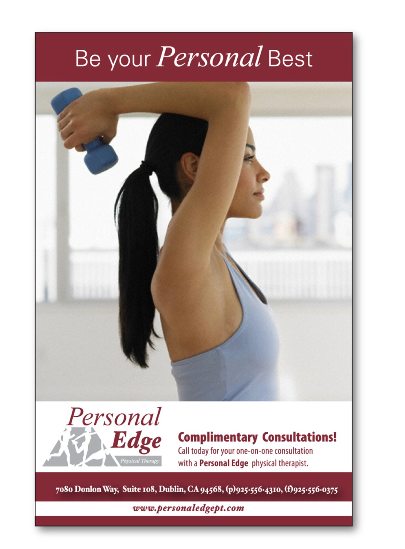

Personal Edge Physical Therapy
-
Create an identity, business forms and website for a locl physical therapy business.
-
Create an identity that reflects the values of the brand - individualized care and treatment.
-
I was given one week to develop the identity, knowing that it would be utilized on everything from letterhead and business cards to their website, advertising and t-shirts. Once the logo was approved, the rest of the forms and website followed within the following month.
-
Based my understanding on the information gathered from the two owners. Then did a brief amount of research online given the short turnaround time.
-
Adobe Illustrator
Adobe Photoshop
Adobe Dreamweaver
HTML
Weebly
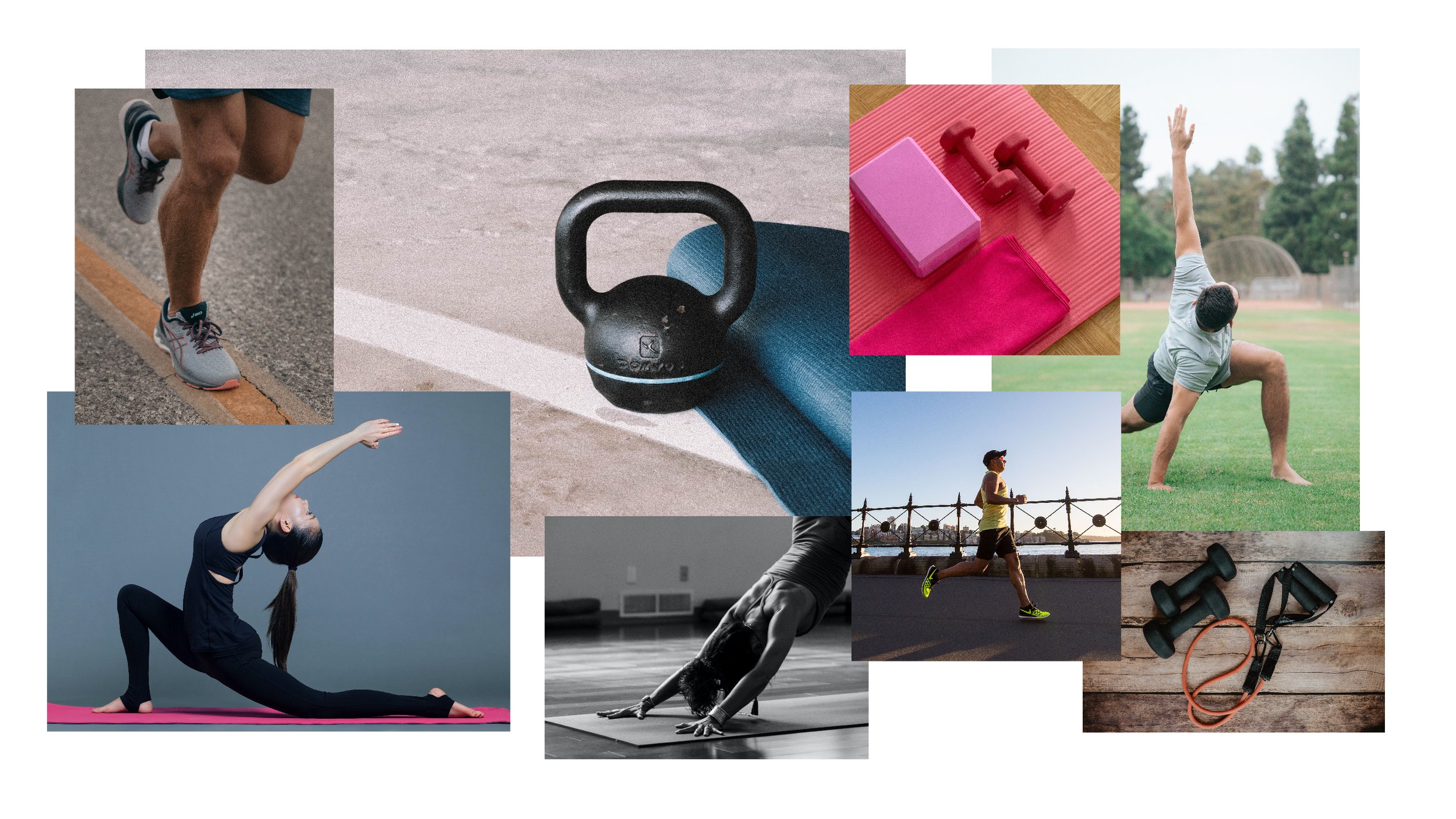
Inspiration
Final Design
The final logo represents exercise, combining modalities and building toward a goal.
Logo

Colors
The client really wanted to incorporate burgundy into the logo, partially because it represents activity and passion, and partially because the interior of the space came with burgundy carpet.

Typography
Hoefler Text represents both tradition with the serif face and energy with the italic versions. The client also really liked the difference between the various weights of the typeface.

Applications
The identity was the first step in building this brand. There were many uses needed from forms, to advertisements, a website and more. A ew examples are below.